Most consultant websites are quietly working against their owners. Not because they look bad, many look perfectly fine. But because they're built around the wrong assumptions about how people actually make decisions when they're looking to hire a professional.
When a potential client lands on your website, they're not in research mode. They're in evaluation mode. They're not asking "What does this person do?" — they're asking "Is this person the right fit for me, and can I trust them with my problem?"
That's a fundamentally different question. And most consultant websites are not built to answer it.
Here are the seven mistakes I see most often — and what each one is actually costing you.
1. Talking About Yourself Instead of the Client's Problem
Open ten consultant websites at random and read the first paragraph of each. The overwhelming majority will start the same way: "I am a [title] with [X] years of experience in [field]."
This is the most common and most damaging mistake a consultant can make, and it happens because it feels natural. Of course you want to establish your credentials. Of course you want to explain who you are. But the person reading your website didn't arrive thinking about you — they arrived thinking about their problem.
The most effective consultant websites lead with the client's situation first. "You've spent years building a team. But growth has created chaos you didn't expect." That sentence immediately tells a specific kind of client: this person understands what I'm going through. That recognition is what keeps someone on your page.
Your credentials belong on your website. But they belong after the client already feels understood — not before. Rewrite your opening paragraph so it describes the client's situation, frustration, or goal before you say a single word about yourself. The moment they feel seen, they'll want to know who you are.
2. No Clear Specialization
Generalism feels safe. If you say you work with "businesses of all sizes across a wide range of industries," you theoretically leave the door open for more potential clients. In practice, you end up resonating with almost no one.
This is one of the most counterintuitive lessons in digital positioning: the more specific you are about who you serve, the more compelling your website becomes to the right people.
A management consultant who says "I help Series A SaaS companies build their first sales team" will always outperform one who says "I help businesses grow revenue" — not because the second person is less capable, but because the first person's website makes the ideal client feel like the message was written specifically for them.
Specialization isn't a limitation. It's a filter. And a filter that attracts the right clients is far more valuable than a wide net that attracts everyone and converts no one.
3. A Services Page That Describes Deliverables, Not Outcomes
A services page that reads like a list of activities — strategy workshops, one-on-one coaching sessions, quarterly reviews — is missing the point of what clients are actually buying.
People don't hire consultants for the process. They hire them for the transformation. A client hiring a leadership consultant doesn't want to buy "twelve bi-weekly coaching calls." They want to walk into board meetings with confidence. They want their team to stop bringing problems and start bringing solutions. They're buying a future version of their situation.
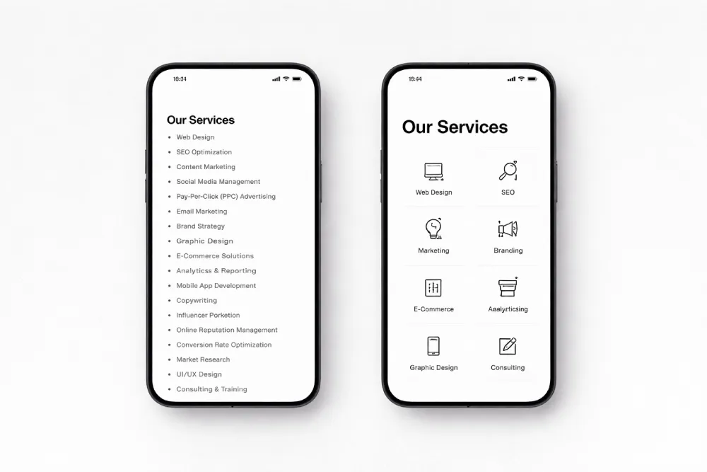
The fix is simple but requires honest thinking: for each service you offer, ask yourself "What does the client's life or business actually look like after this?" and lead with that. The mechanics of how you get there can follow.
4. Hiding Behind Vague Language
Consultant websites are particularly prone to language that sounds sophisticated but communicates very little. Phrases like "holistic approach," "data-driven insights," "transformative results," and "empowering your organization" have been diluted to the point of meaninglessness through overuse.
When someone reads these phrases, their brain does something important: it disengages. Vague language triggers a kind of cognitive shrug. The visitor doesn't become skeptical — they simply stop paying attention. And once you've lost their attention, you've lost them.
Specificity is the cure. Instead of "I help companies improve their performance," try "I help mid-sized logistics companies reduce operational waste by redesigning their internal workflows." Instead of "transformative results," tell them what those results looked like for a real client, in numbers or concrete outcomes wherever possible. Precision signals expertise. Vagueness signals the opposite — even when it's not intended to.
5. No Visible Process
One of the most underappreciated drivers of inquiry hesitation isn't price, and it isn't uncertainty about your qualifications. It's the fear of the unknown: What actually happens if I reach out? What am I getting myself into?
This fear is especially present for first-time buyers of consulting services, or for clients who've had a bad experience in the past. They've been burned by vague engagements with fuzzy scope and unpredictable timelines. Before they'll reach out, they need to feel like they understand what's ahead.
A simple "How It Works" section — three or four steps, clearly labeled, that walk through what the engagement actually looks like — does an enormous amount to reduce this hesitation. It shows that you have a system, that engagements don't drift, and that the client will be oriented throughout the process rather than left wondering what's happening.
6. Testimonials That Don't Tell a Story
Testimonials are on almost every consultant website. But most of them are doing far less work than they could be.
The problem isn't that the testimonials are fake or fabricated — it's that they're generic. "Working with [Name] was a game-changer for our business." "I would highly recommend this consultant to anyone." These quotes give the reader almost nothing to hold onto. They confirm that the person is liked, but they don't demonstrate that the person is effective.
A testimonial that works tells a compressed story: where the client was before, what specifically happened, and what changed as a result. It names the problem. It names the outcome. If it mentions a tangible result — a percentage, a timeline, a concrete shift — it becomes even more credible.
If you don't currently have testimonials in this format, it's worth reaching out to past clients and asking a specific question: "What was the situation before we worked together, and what changed as a result of our work?" The answers to that question will give you far more useful material than a generic "how was your experience?" request.
7. A Contact Page That Asks for Too Much Too Soon
The final mistake is one of friction — and it shows up most clearly in the contact experience. Many consultant websites either bury the contact form on a separate page that requires multiple clicks to find, or they make the form itself feel like a commitment.
Long forms that ask for company size, budget range, timeline, and project details before a single conversation has even taken place create a psychological barrier. The implicit message is: prove you're worth my time before I respond. For a prospective client who's still evaluating whether to reach out at all, this is often enough to make them decide not to.
The highest-converting contact experiences do the opposite. They minimize the number of required fields, use language that frames the first step as a low-commitment conversation rather than a formal inquiry, and tell the person what happens after they submit — when they'll hear back, what the next step looks like, and how long it takes.
The goal isn't to collect information — it's to start a conversation. Design your contact experience around that goal and you'll see a meaningful difference in how many people follow through.
The Pattern Underneath All Seven
Look at these seven mistakes and you'll notice they share a common thread: they all stem from building a website around what you want to say, rather than around what your ideal client needs to hear in order to trust you enough to reach out.
The good news is that none of these are difficult to fix in isolation. The challenge is that fixing them requires a willingness to step out of your own perspective and genuinely think from inside the client's experience — to ask not "What do I want people to know about me?" but "What does someone who needs what I offer actually need to see before they feel confident enough to get in touch?"
That shift in perspective is what separates a website that sits quietly in the background from one that consistently brings in the right kind of work.
Is your website working for you or against you?
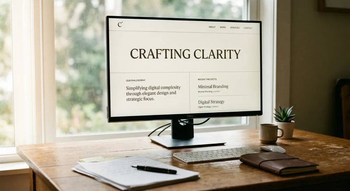
At Evida Studio, we build digital presences for service professionals that turn visitors into conversations — without the guesswork.
Let's Review Your Website