When the Website Must Match
the Calibre of the Work
An architect who works with high-end clients cannot afford a website that reads as anything less than exceptional. This breakdown covers how a dark, premium aesthetic and authority-first structure communicate value before a single project is seen.
A portfolio that competes at
the level of the projects inside it.
The scenario: AXIS Atelier, a high-end architecture studio working on residential and hospitality projects across California, New York, and Florida. Clients evaluate vendors on image as much as capability. The site had to communicate premium positioning immediately — before a single project image loaded.
The challenge is specific to this niche: architecture portfolios often look like photography galleries with a contact form attached. They show work without selling the thinking behind it. This site needed to do both.
Dark, deliberate, and impossible to misread.
Each decision below is the result of one filter: what does a high-end client need to feel in the first 10 seconds to stay on the page?
Near-black background with a subtle CSS dot-grid texture throughout. No white. No pastels. Semi-transparent glass panels for content cards.
Dark palettes signal exclusivity and authority in high-end sectors: luxury agencies, private wealth managers, executive studios. The client who can afford premium architecture has a visual vocabulary that reads dark as premium, not heavy. White backgrounds in this context signal generic.
Instant positioning. Before reading a word, the visitor's brain categorizes this as a high-end studio. The right client feels at home. The wrong client self-selects out — which is equally valuable.
Serif typeface for headings, paired with monospace for data and spec labels. Geometric and precise throughout.
Architecture is a discipline of form and proportion. The serif mirrors the profession: rooted in tradition, refined by intention. Sans-serif would read as generic. Mono on stats signals technical precision — a quality high-end clients want to see in someone they're trusting with a building.
Typography becomes part of the portfolio itself. The site's visual language echoes the studio's design language, creating coherence that sophisticated clients notice instinctively.
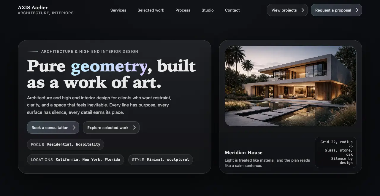
"Pure geometry, built as a work of art." Aspiration-led, not service-description. With gradient highlight on the word "geometry."
Clients commissioning high-end architecture aren't buying square meters. They're buying a vision. The headline sells the vision first. "Architecture and Interior Design Services" describes a commodity. "Pure geometry, built as a work of art" describes a result worth wanting.
The right prospective client reads the headline and thinks: "This is someone who thinks the way I think." Emotional resonance before logic.
The right side of the hero shows a CSS-generated geometric sculpture — animated shapes with grid overlays — rather than a photograph of a completed project.
A photo in the hero risks the visitor judging a single project before seeing the full portfolio. A geometric sculpture communicates the core idea of the studio — precision, form, restraint — without anchoring judgment to one building. It is concept before execution, which is exactly how architecture works.
The visitor's first impression is of a design philosophy, not a specific commission. This opens the mind rather than narrowing it. Portfolio curiosity increases.
A single word in the H1 ("geometry") receives a blue-to-violet gradient. Everything else remains white on dark.
Restraint amplifies impact. One gradient word on a dark background creates far more visual tension than a fully colored headline. The eye is drawn to it immediately. It signals: this studio knows when to add and when to subtract — which is the entire premise of the work.
The brand promise — geometry as art — is the single most memorable element of the first viewport. It anchors the entire page's visual identity.
Small pill-shaped chips below the hero copy display studio specifics in monospace type: focus areas (residential, hospitality), locations (California, New York, Florida), and style direction (minimal, sculptural).
High-end clients evaluate quickly. Credentials need to be visible without dominating the visual hierarchy. The chip format communicates positioning in a compact, scannable way that doesn't interrupt the flow of the hero section.
The visitor qualifies the studio as geographically and stylistically relevant before scrolling to the portfolio. Saves time on both sides.
Two CTAs in the hero: "Book a consultation" (primary, styled) and "Explore selected work" (secondary, minimal). Clear visual hierarchy between them.
Not every visitor arrives ready to commit. The client who is evaluating multiple studios needs to see the work before booking. The secondary CTA captures them and moves them deeper into the portfolio — which is where the decision actually forms. A single CTA would abandon this visitor at the hero.
Both visitor types are served: the decisive client books immediately; the research-mode client explores the portfolio and books after seeing the work. No one leaves the hero without a logical next step.
Performance that matches the premium aesthetic.
A dark, animation-heavy site carries performance risk. Every visual choice was balanced against load time and rendering stability.
backdrop-filter with a solid-color fallback for unsupported browsers.The portfolio doesn't sell the work.
The context around it does.
Any architect can show beautiful project images. What this site does is establish the frame around those images before they're seen. By the time the visitor reaches the portfolio section, they've already decided this is a studio worth considering. The images confirm it. They don't have to do all the work alone.
Your next high-value client is forming an impression right now.
Whether or not that impression leads to a conversation depends on what your site communicates in the first 10 seconds.