Designing for the Appointment
People Keep Postponing.
Dental anxiety is real and measurable: surveys consistently show that 36% of people avoid the dentist due to fear. The website is the first point of contact where that fear is either amplified or dissolved. This case study covers every decision made to dissolve it.
Azure Dental Studio. Luxury positioning.
California. Clients who value discretion.
The scenario: a high-end cosmetic and general dentistry practice targeting clients who value premium experiences and expect a spa-level environment. The core challenge is one shared by almost every dental practice: the category carries built-in anxiety, regardless of how good the actual service is.
The site needed to do something most dental websites don't: actively dismantle the anxiety before the visitor has even considered booking. Not with reassuring words ("we're gentle!") but with structural and visual signals that communicate safety without stating it.
Trust before credentials.
Calm before information.
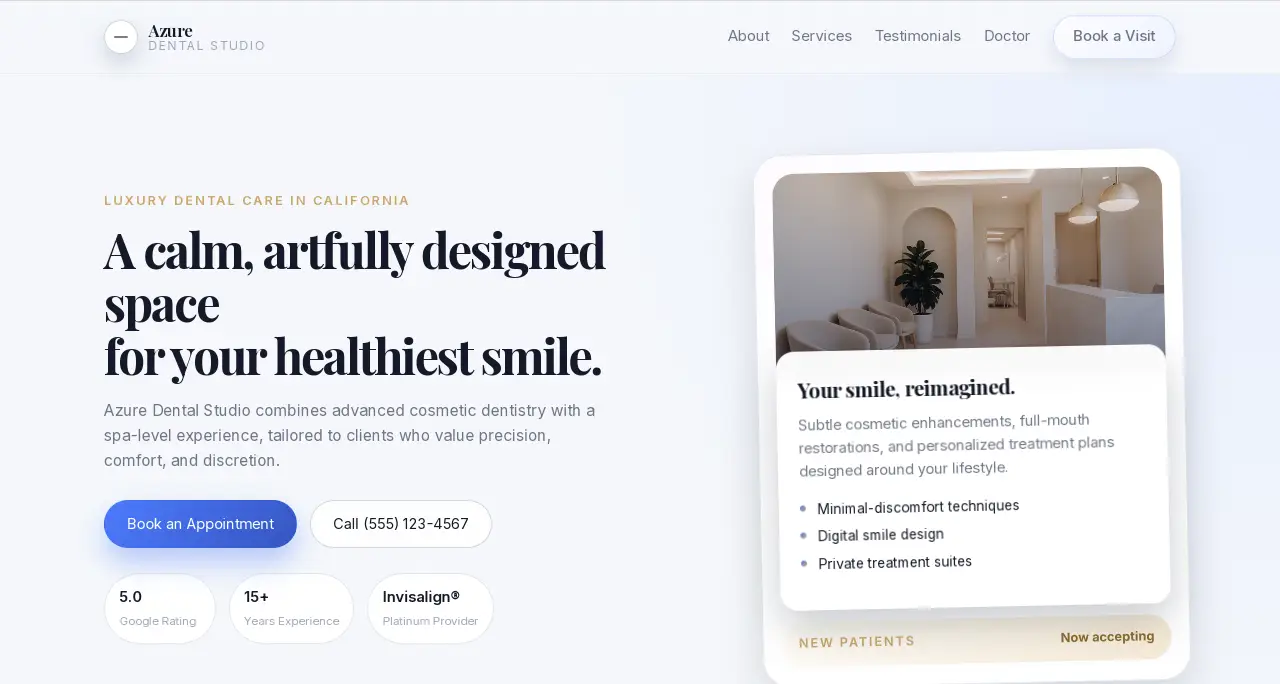
"A calm, artfully designed space for your healthiest smile." The word "space" positions the practice as an environment, not a procedure.
Anxious patients don't fear the dentist — they fear the feeling of being in the chair. Describing the experience as a "space" (not a "clinic" or "office") activates a different mental model: a place you go to feel good, not a place something happens to you. "Artfully designed" signals aesthetic care. "Healthiest smile" is the outcome, not the procedure.
The first sentence reframes the entire category. The visitor arrives with dental anxiety and reads a description of a spa. The cognitive dissonance reduces resistance.
Three data points visible in the first viewport: 5.0 Google Rating, 15+ Years Experience, Invisalign Platinum Provider.
Social proof reduces anxiety. But social proof buried in an About section doesn't reach the visitor who bounces after 8 seconds. These three metrics — each addressing a different type of doubt (quality, longevity, specialization) — appear before the fold, where they can work on the visitor who hasn't committed to scrolling yet.
Authority established in the first viewport, alongside the emotional promise of the headline. The visitor gets both: "this place feels right" and "this place is credible."
The hero subhead: "…tailored to clients who value precision, comfort, and discretion." Three specific words, each cancelling a specific objection.
Precision addresses: "Will they get it right?" Comfort addresses: "Will it hurt?" Discretion addresses: "Is this a place where I'll feel judged about my teeth?" All three are common pre-booking anxieties. The subhead answers them in six words without ever using the words "pain-free" or "non-judgmental" — which flag exactly what they deny.
Objections cancelled before the visitor consciously forms them. The path to booking is cleared at the subhead level.
Two CTAs: "Book an Appointment" (primary, solid) and "Call (555) 123-4567" (ghost button, secondary).
Anxious patients frequently prefer to speak to someone before booking online. Hiding the phone number in a footer or contact page creates friction at exactly the moment the visitor is most motivated but also most hesitant. The ghost button keeps the phone option visible without visually competing with the primary CTA.
Captures conversions from two types of visitors: the decisive online booker and the reassurance-seeker who needs to hear a voice before committing.
The booking form lives lower on the page, not in the hero. The hero is purely visual and copy.
A form in the hero signals: "we want something from you immediately." For an anxious patient, a form is a commitment signal too early in the relationship. The spa-positioning requires that the visitor first feels invited into the experience — then asked to take action. Form-in-hero breaks that sequence.
The hero is experienced as an invitation, not a transaction. Visitors who scroll to the form are warmer and more committed than visitors who encounter it cold.
Fast, stable, and built to perform on every screen.
The appointment is won or lost
before the patient picks up the phone.
Every structural and copy decision on this site was made with one insight in mind: dental anxiety is not resolved by dental reassurance. It's resolved by environmental signals — the feeling of a place — before any clinical information is processed. The site creates that environment. Then the practice delivers on it.
The most common reason patients don't book is the website.
Not the price. Not the location. The feeling the site creates in the first 10 seconds.