Medical Credibility.
Without the Clinical Coldness.
A dermatology website carries a dual burden: it must feel clinically credible and personally inviting at the same time. Too clinical and patients feel processed. Too soft and the doctor's expertise isn't communicated. This case study covers how that balance was struck, one decision at a time.
Dr. Elena Rivera. Board-certified.
Private clinic. New York City.
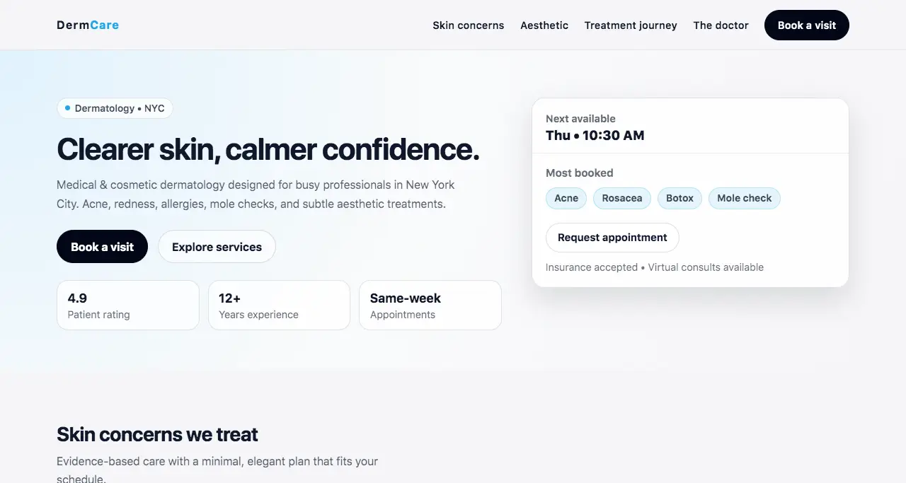
The fictional scenario: DermCare Clinic, a private dermatology practice serving busy professionals in Manhattan. Both medical and cosmetic services on offer. The target patient is a professional in their 30s or 40s who researches before booking and evaluates the practice as much on digital presence as on credentials.
The immediate challenge: a pure medical aesthetic (whites, blues, sterile layouts) would repel the cosmetic patient. A pure cosmetic aesthetic (editorial, fashion-adjacent) would undermine the medical patient's trust. The site needed to live in the space between.
The tonal balance between authority and warmth.
"Clearer skin, calmer confidence." — two outcomes in four words.
The medical patient wants a result (clearer skin). The cosmetic patient wants a feeling (confidence). This headline serves both simultaneously without mentioning either service category. It sidesteps the either/or problem entirely.
Both patient types feel addressed from the first line. Neither feels like a secondary audience. No visitor is lost in the first three seconds.
"Medical & cosmetic dermatology designed for busy professionals in New York City." The subhead names the audience, not just the service.
When a person sees themselves described on a website, they stop scanning and start reading. "Busy professionals" is specific enough to create recognition without being exclusionary. The NYC qualifier is both geographic SEO and social proof: this is a practice that operates at that level.
The target patient self-identifies immediately. The sense of "this is for someone like me" reduces the psychological distance between visitor and patient.
Off-white "section-soft" background instead of clinical white. Warm, not cool-toned.
Pure white reads as hospital. Off-white reads as premium clinic. The difference is less than 10% on the color scale and 100% on perceived warmth. Patients visiting for cosmetic reasons respond to warmth. Patients visiting for medical reasons respond to cleanliness. Off-white delivers both.
The site feels professional without triggering the anxiety that clinical environments can create. First appointments for sensitive services are more likely to be booked.
A dedicated 3-step "Treatment Journey" section: Consultation → Plan → Follow-up. Numbered, named, and described in plain language.
The #1 barrier to booking a first medical appointment is not knowing what happens next. "What if I don't know what to say?" "How long will it take?" "What are they going to do?" The Journey section answers all of these before they're asked. It removes the unknown.
Visitors who reach this section are significantly more likely to book. The decision has been pre-made for them: they know what they're signing up for.
Medical dermatology ("Skin concerns") and aesthetic treatments ("Aesthetic") have separate navigation anchors and distinct sections on the page.
A patient coming for acne treatment and a patient coming for subtle fillers are in different emotional states. Mixing their services on a single page creates cognitive noise. Clear separation says: "we understand the difference between your needs. You're not in the wrong place."
Each visitor type navigates to their relevant section without having to parse irrelevant services. Shorter path to "this is for me."
"Book a visit" throughout. Not "Schedule an appointment" or "Request consultation."
"Appointment" carries clinical weight. "Visit" is what you do with someone you trust. The language difference is subtle but it consistently lowers the perceived formality of the first step, which is the highest-friction moment in the conversion path.
More first-time visitors cross the threshold from consideration to action. Especially effective for cosmetic patients who haven't booked this type of visit before.
Clean, semantic, and fast on every device.
The patient experience starts
before the first appointment.
Every design decision on this site was tested against one question: does this make a first-time patient more or less likely to book? Tone, structure, copy, and palette all serve that single conversion moment. The medical credibility is there. So is the human warmth. Neither was left to chance.
Your next patient is already comparing practices online.
The site that feels right wins the inquiry — regardless of credentials.