Designing for the Patient
Before the Professional
A therapist website rarely fails because it looks bad. It fails because it answers the wrong question. This is a plain English walkthrough of the design, the words and the search choices behind a psychiatry practice website in New York, and the reason behind each one.
A private psychiatry practice in New York.
One visitor, one decision.
This is a concept build. We designed it as an open example so the full reasoning could be published without putting a real client's private material online. The practice is invented. The problem it solves is not.
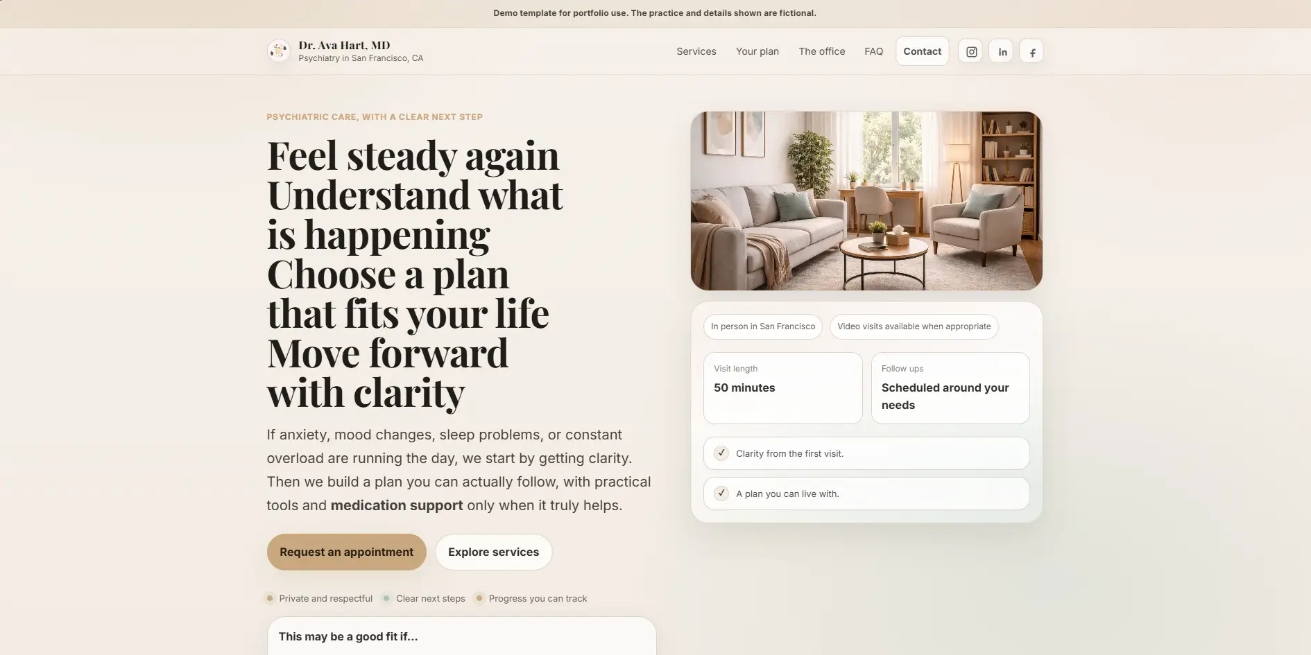
Say her name is Dr. Ava Hart. Board certified psychiatrist, private practice in Manhattan. The person visiting her site is an adult dealing with anxiety, mood shifts or long running overload. They have decided to do something about it. They have not contacted anyone yet.
That last detail changes everything. This is not a returning patient checking an appointment time. This is someone who spent weeks working up the courage to type a search. The website has one job. Make them feel safe enough to send a short message.
Every choice has a reason.
Here is each one, in plain words.
Each card below has three parts. What we did, why it works on a human level, and what it is meant to change for the visitor. These are design intentions rather than measured results, because this is a concept build with no live traffic behind it. The reasoning is what matters here, and the reasoning is what carries over to a real practice.
Warm neutrals. Terra cotta, amber and sage green on an off white base. No clinical blues.
Cool blue and white reads as hospital. Warm neutrals read as a room with a person in it. Someone reaching out for the first time needs to feel calm before they feel impressed.
The page feels approachable before a single word is read. The emotional cost of reaching out drops slightly, and slightly is often enough.
"Feel steady again. A plan you can trust." The headline names what the visitor wants, not what the doctor has.
Nobody arrives thinking "I need a board certified MD." They arrive thinking "I need to feel better." The headline answers the thought they came in with.
Recognition in about three seconds. The visitor feels understood before they reach the second line.
A small line sits above the main headline: private psychiatry in New York. Plain, factual, unglamorous.
The creative headline speaks to a feeling. Search engines and skimmers need the literal facts, service and city, somewhere near the top. This small line carries them so the headline never has to.
The page can rank for local searches without the headline turning into a list of keywords.
A small floating card shows three things: the office location, the session length of fifty minutes, and the first step, which is a short message.
Every first time visitor has the same three silent questions. Where is this. How long does it take. What do I have to do first. The card answers all three without a click.
The most common reasons to leave are removed at the first visible moment, not buried three scrolls down.
Three short labels sit under the buttons: confidential, no pressure, clear steps.
The biggest barrier to a first message is the fear of being exposed or pushed. Those three words name the three hesitations people rarely say out loud, and answer them in advance.
The visitor knows what the first step will feel like before they take it. Unknowns are what stop people, so we remove them early.
Two buttons at the top. "Contact me" as the main one and "How I help" as the quieter second. The wording avoids "Book Now" and "Get Started".
Not everyone arrives ready. The second button gives the person who is still reading somewhere to go instead of leaving. And "book" sounds like a commitment, while "contact" sounds like a conversation. A conversation is much easier to say yes to.
Nobody reaches the bottom of the first screen without a next step that matches how ready they actually are.
Services are written as an experience rather than a clinical definition, and each one gets its own page instead of a single crowded list.
"Psychiatric evaluation: a comprehensive assessment of your mental health history" describes a procedure. "We take time to understand the whole picture, and you leave with a clearer explanation" describes what the hour feels like. Separate pages also give each service a real chance in search, because one page cannot rank well for four different things.
The visitor can picture the session before it exists, and each service has its own entry point from search.
Six to eight real questions, written in the words people actually use, placed beside a warm photo rather than in a plain full width block.
A full width FAQ reads like paperwork. Next to a photo it still reads like a person talking. It is also the one place on the site where everyday search language belongs, so questions about cost, insurance, first sessions and online appointments can be answered directly.
Each answered question removes one more reason not to write, and the section quietly matches the long questions people type into search.
Search visibility, without sounding like a search result.
Most therapist websites go one of two ways. Either they read beautifully and never appear in search, or they are stuffed with phrases like best therapist NYC anxiety depression and read like a pamphlet. Both lose the same person.
The way through is simple. Decide which parts of the page are for feeling and which parts are for facts, then keep them separate. Headlines and the small phrases between sections stay human. The title tag, the line above the headline, the section headings and the FAQ carry the plain words: the specialty, the city, the practical questions.
On this build that meant a title naming the service and the city, one clear sentence as the page description, a service line above the creative headline, separate pages for each service, and an FAQ written in ordinary language. Nothing exotic. It is the absence of these basics, far more than any clever trick, that keeps most practice websites invisible.
Fast on a phone.
Nothing jumping around while it loads.
None of the thinking above matters if the page is slow or if it shifts under someone's thumb while they read. Most people find a therapist on a phone, often late in the evening, often on a patchy connection. So the site is built for that first and widened for desktop afterwards.
The structure uses proper headings in order, labels on every interactive area, and a written description on every image. The FAQ uses the browser's own <details> and <summary> elements, so it opens with a keyboard and works for screen readers without any JavaScript at all.
The patient's experience starts long before the first session.
Every decision here was checked against one question. Does this make it easier or harder for a nervous person to take the first step? Colour, wording, layout, button text, page speed. All of it answers to that.
That is the difference between a website that looks professional and one that actually brings people through the door. The aim was never to impress the psychiatrist. It was to reassure the person searching for her at eleven at night.
Your next client is already searching.
If your website is not giving them a reason to stay, every search is an opportunity left on the table.