The Same Problem.
A Different Emotional Frequency.
Not every therapist's patient arrives in the same state. This version of the therapist platform was designed for a quieter, more introspective visitor — someone who responds not to warmth and immediacy, but to space and stillness. The design thinking shifts accordingly.
Two sites. Same niche.
Different design philosophy.
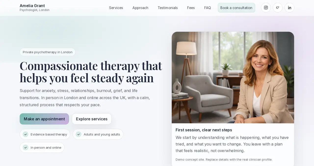
The first therapist platform (v1) was built on warmth: terra cotta, sage green, dual CTAs, immediate trust signals. It works for the patient who arrives ready to act and needs a gentle push.
This version was designed with a different patient in mind: the one who opens tabs late at night, reads slowly, and needs the site itself to feel like the therapy they're looking for. Quiet. Unhurried. No pressure to decide.
Restraint as a deliberate choice,
not a lack of ideas.
More generous padding between sections. Larger line-height. Fewer elements per viewport.
Visual density communicates urgency. Whitespace communicates the opposite: patience, space, time. For the patient who hasn't decided yet, a page that feels unhurried removes the pressure of "I have to make a decision right now." They can stay longer. Think longer.
Longer time on page. Deeper scrolling. The visitor who was unsure becomes a visitor who has read enough to feel ready.
A serif typeface for headings instead of the bold sans-serif used in v1.
Sans-serif reads as modern, direct, efficient. Serif reads as considered, literary, trustworthy over time. The patient who is introspective by nature often responds more readily to the visual language of depth and permanence that serif communicates. It signals a different kind of professional: one who thinks before they speak.
The site's aesthetic matches the visitor's self-perception. The therapist's visual language and the patient's inner register become aligned before a word is read.
CTA buttons use a soft sage-to-lavender gradient instead of a solid brand colour. Lower contrast. Higher elegance.
A high-contrast CTA says: "click me now." A gradient CTA with softer contrast says: "when you're ready." For a patient who resists pressure, the lower visual urgency of the button removes the feeling of being sold to. The CTA becomes an invitation, not a demand.
Clicks come from a more considered state of mind. The patient who clicks is further along in their decision than the average visitor — which means fewer appointments that don't follow through.
The hero card beside the photo communicates process ("First session, clear next steps") rather than logistics (address, duration, first step) as in v1.
The introspective patient is less worried about "where is the office" and more worried about "what will happen to me in there." The card answers the deeper question: what will you leave the first session feeling and knowing? That is more reassuring than a street address.
The patient who reads the card has already imagined the experience. That imagination reduces the emotional distance between considering and booking.
Fewer elements per section. No trust dots in the hero. No animated micro-signals. Trust is built through tone and space, not components.
Every element on a page competes for attention. When too many things compete, the visitor's cognitive load increases — which is the last thing a person already managing anxiety needs to feel on a therapy practice website. Removing non-essential elements is itself an act of care.
The visitor's attention naturally lands on the content that matters: the headline, the therapist's words, the CTA. Nothing distracts from the decision.
Two directions. Both correct.
For different patients.
The first platform was built for energy. This one was built for stillness. Neither is objectively better — the right version depends entirely on the therapist's positioning and the emotional state of their ideal patient. This is exactly why no two projects at Evida Studio begin with a template.
Your website's visual language is already saying something.
The question is whether what it's saying matches what your ideal patient needs to hear.