Picture this. You're in a city you don't know well and you're hungry. You open Google Maps and see two restaurants side by side. The first has photos, reviews, opening hours, even a photo of the owner. The second has nothing but a name and a phone number.
Which one do you choose?
Almost always the first. Not because the food is necessarily better, but because it makes you feel like you know where you're going. It doesn't ask you to risk stepping into the unknown. It has built enough trust — through a screen — to make you tap "directions."
This is what happens with your website every single day. The difference is that most professionals never see it happening.
Trust Is Not One Thing
Most professionals believe trust is built through credentials: degrees, years of experience, titles, certifications. Those things matter. But they're not what makes someone feel "I want to reach out to this person." They're only one piece of the picture.
The Stanford Web Credibility Project — a team that studied exactly this for years — found something that sounds unfair at first: people judge the credibility of a website primarily by how it looks. Only after that do they look at what it says.
That doesn't mean content doesn't matter. It matters enormously. But if "how it looks" doesn't pass the first test, no one will ever get to "what it says."
In practice, the trust a website builds is made of three distinct layers. If any one of them is missing, the visitor won't take the next step.
"Are they real?"
Before deciding anything else, a visitor wants to confirm that what they're looking at is a genuine professional presence — not something abandoned, not something generic, not something untouched since years ago. They're looking for confirmation: a face, a name, a location, some trace of actual existence in the world. A website with none of these doesn't inspire confidence. It inspires caution.
"Do they know what they're doing?"
This is the competence layer. Credentials play a role here, but so does how you write, whether your copy shows you understand the visitor's problem, whether there are examples of your work, and whether other people have trusted you and are willing to say so.
"Do they get me?"
This is the most overlooked layer of all. You might have proven you're real and capable. But if the visitor doesn't feel the site is speaking to their world — their situation, their specific problem, what they're actually looking for — they won't reach out. The website has to feel like it was written for them, not just about you.
All three layers need to be present. One without the other two isn't enough. And all three need to land before someone reads far enough to find your credentials.
The Problem with the "Professional Tone"
Here's a comparison that might be familiar.
Imagine you're a business consultant with years of experience and real results to show. Your website says:
"I provide consulting services for small and medium businesses. Specializing in growth strategy, team management, and operational optimization. Get in touch to see how I can help."
That copy is accurate. It covers exactly what you do. And it's almost completely ineffective.
It doesn't speak to the business owner who can see something isn't working but can't put his finger on what — the person who lands on your site wondering "maybe this person can help me figure out what's going wrong." Your copy doesn't acknowledge his worry. It doesn't say "I understand where you are right now." It just tells him what you do.
Now imagine the site said instead:
"There's a point in every business where you feel like you're working harder but moving slower. That's where my work begins."
Same credentials. Same experience. But now the site is speaking to the right person, in the right way.
Many professionals use formal, resume-style language because they want to sound credible. The result is copy that sounds credible but doesn't sound human. And that gap is where visitors quietly disappear.
A formal tone can create distance instead of closeness. And distance is the enemy of trust.
The Invisible Fear That Keeps People Away
There's something that rarely gets discussed openly but sits at the center of every decision someone makes about whether to reach out.
When a potential client is thinking about contacting you, they're not only thinking "will this person solve my problem?" They're also thinking — often without realizing it — "if this doesn't go well, what do I lose?" Time. Money. The discomfort of making the wrong call. Maybe sharing something personal with the wrong person.
That quiet fear is one of the biggest obstacles you have to get past. And your website needs to address it — not by ignoring it, but by actively reducing it.
Explain what happens after contact. If a visitor doesn't know what follows when they send you a message, the unknown makes them hesitate. "You send a message, I get back to you within 24 hours, we set up a free intro call, you decide if you want to move forward." That one sentence makes the other person feel like they're in control.
Offer something with no commitment attached. A short intro call, a free first consultation. Something that lets the visitor get to know you before they decide whether to continue. This lowers the barrier to that first contact — and more people take the first step.
Stay consistent across every touchpoint. If your website, your social media, and the way you communicate all reflect the same voice, the same energy, and the same values, the visitor feels like they already know who they're going to meet. That's one of the most reassuring things there is before a first interaction.
Four Things You Can Check Today
The gap between a website that generates inquiries and one that just sits there rarely comes down to one large problem. It's usually several small ones, each individually fixable.
1. Your opening line
Read the first sentence a visitor sees when they land on your homepage. Ask yourself: if someone who has never heard of me read this, would they immediately know whether I'm the right person for what they're dealing with? If it starts with "I am" or "I provide," rewrite it from the visitor's perspective. What are they experiencing right now? What are they hoping to find?
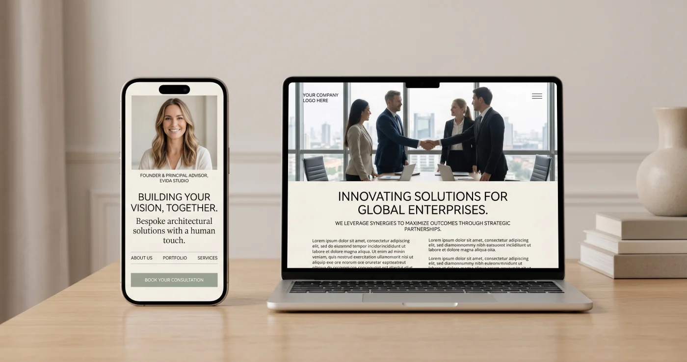
2. Your photograph
Is there a genuine photograph of you on your website — not a logo, not a stock image — that a visitor can find within the first scroll? Stock photography is immediately recognizable as stock photography. When visitors see it, they read between the lines: this person doesn't want to show who they are. For a profession built on personal trust, that's a significant cost for a seemingly small design decision.
3. Your testimonials
Are there testimonials on your site? If so, are they specific enough to be useful? A testimonial that describes a real situation and a real change — something like "I came in with X and left with Y" — carries far more weight than a general endorsement. Two or three specific testimonials consistently outperform ten generic ones.
4. Your next step
What is the one action you want a visitor to take after reading your page? Is it immediately clear what that action is, with one prominent way to take it? If a visitor has to hunt for a contact link, or if three different calls to action are competing for attention, most will choose none of them. One clear path forward, consistently placed, converts better than multiple options every time.
The Test That Costs Nothing
Find someone who knows nothing about what you do — a friend from a completely different field, a family member, anyone. Ask them to open your website on their phone, because that's where the majority of your visitors are coming from, and to look at just the front page.
Then ask them three things:
What do you think this person does? If the answer isn't immediate and accurate, there's a clarity problem worth solving.
Who do you think this is for? If the answer is "I don't know" or "everyone," there's a problem with how you've defined your audience.
If you had this kind of problem, would you reach out? Listen to both the answer and the hesitation, if there is any.
This test costs nothing and can give you more useful information than almost any analytics tool.
The potential client who didn't reach out didn't necessarily decide they don't need you. They may simply not have figured out fast enough that they do. That distinction is where most websites quietly fail — and where small, specific changes make a real difference.
Ready to build a digital presence that earns trust?
At Evida Studio, we craft custom websites for service professionals focused on clarity, structure, and conversion.
Let's discuss your project