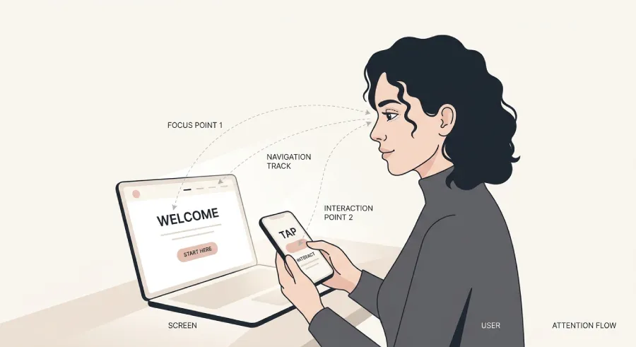
Picture someone landing on your website. They don't start at the first word and move line by line, the way they'd read an article. Their eyes do something completely different. They jump. They pause here for a moment, there for another, and within almost no time at all, they've already formed a picture of whether it's worth sticking around.
This isn't a bad habit on the visitor's part. It's how human vision has worked in front of a screen since the internet existed. And if your layout doesn't account for it, you lose people who would have trusted you, simply because they never got the chance to understand that.
Scanning Isn't Laziness. It's Survival.
The brain takes in a huge amount of visual information every second. To avoid being overwhelmed, it filters automatically. It keeps what stands out, what has contrast, what resembles something familiar, and ignores the rest.
On a website, that means the full text almost never gets read. What gets read are fragments. The headline, if it stands out. A bolded word. A button in a different color. A photo, before anything else. Everything else blurs into the periphery unless something actively pulls the eye toward it.
If your core message is buried inside a paragraph with no visual hierarchy, it simply won't be seen. Not because it doesn't matter, but because the eye never stopped there in the first place.
The Pattern the Eye Follows
There's a well-documented pattern in how the gaze moves across a page that mixes text and images. It starts top left, sweeps horizontally to the right, drops diagonally, then scans horizontally again further down. Shaped roughly like the letter Z, or on denser pages, like the letter F.

This isn't abstract design theory disconnected from your business. It has very concrete implications for where you place what.
Your most important message needs to sit where the eye lands first, top left or center of the first screen, not buried under three paragraphs of introduction. Your call-to-action button needs to sit where the gaze naturally ends up, not somewhere the visitor has to hunt for. And anything you truly need someone to notice needs visual weight, size, color, or surrounding space, so the eye stops there for even half a second longer.
What the Eye Picks Up First
Before any word, the eye picks up shapes and color. That's usually the order in which a first screen gets judged: the image or visual element first, if something large and distinct is present. Then the headline, if it's different enough in size and position from the surrounding text. Then the call-to-action button, if it stands out in color from the background. Only after all of that has passed the first filter does the eye come back to actually read something in detail.
Which means a page with dense text, uniform typography throughout, and nothing that visually stands out is effectively saying nothing in those first few seconds, no matter how well written the copy is.
The Mistake That Keeps Repeating
Many independent professionals design their site like it's a document, not a page meant to be scanned. They open with a long introductory paragraph explaining who they are, what they do, how many years of experience they have, all before the visitor ever reaches the actual point.
The problem isn't the content. It's the order. The visitor hasn't reached the stage of caring about your years of experience yet. What they care about first is understanding whether you're the right person for them. Everything else comes after, once their eyes have already stopped and decided to stay.
How to Build a Page That Scans Correctly
You don't need less content. You need the right hierarchy.
Your core message, what you do and who it's for, needs to be the most visually dominant element on the first screen, not hidden inside a block of text. Every section below needs a heading that communicates, at a glance, what someone will find there, so that even a visitor who scrolls without reading anything in detail still understands the structure. And whatever you consider important needs some visual signal, size, color, or spacing, because without that signal, it simply won't get noticed.
The Bottom Line
Your website doesn't get read like a book. It gets scanned like a painting. And what a visitor retains from that first scan isn't determined by how well you write, it's determined by where you've placed the visual weight.
Well-written copy in the wrong spot will never be read by anyone. A simple message in the right spot will be seen by everyone. Your job isn't to write more. It's to put the right thing exactly where the eye looks first.
Want a website that says the right thing on the first scan?
At Evida Studio, we design visual hierarchy around how visitors actually look at a page, not how we'd wish they'd read it.
Let's Talk About Your Project