When was the last time you visited your own website as a stranger? Not to make a change or check something technical. As someone who has never heard of you, who just found you on Google thirty seconds ago, and is now deciding whether it's worth reading further?
Most professionals never do this. And it costs them more than they realize.
The visitors who find your website and leave without getting in touch didn't decide they don't need you. They just didn't figure out fast enough that they do. Understanding what happens in those first few seconds, and the reasons behind it, is one of the most valuable things you can do for your practice.
The Brain Doesn't Read. It Scans.
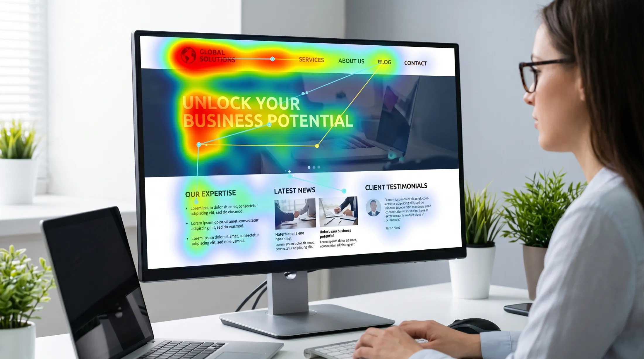
Research into how people process web pages consistently shows the same pattern: visitors don't start by reading. In the first seconds after a page loads, the brain scans. It picks up on visual weight, color, image quality, and fragments of text, assembling a general impression before a single sentence has been consciously processed.
Studies on visual credibility judgment have found that people form an opinion about a website's trustworthiness in under 50 milliseconds. That's not enough time to read a headline, let alone evaluate your credentials or your approach.
What this means in practice is straightforward: if your website doesn't communicate the right things visually and structurally in the first few seconds, most visitors will never get to the point of reading what you wrote. The words, the qualifications, the careful descriptions of your services all depend on clearing a bar that happens before any of it is read.
The Wrong Question Most Websites Are Answering
The most common mistake in professional service websites isn't poor design. It's a misalignment between what the website communicates and what the visitor is actually trying to figure out.
When someone lands on your page, they are not asking: "What does this person do?" They already have a rough sense of that from the search result or the referral that brought them here. The question they're actually trying to answer is something more instinctive: "Is this the right person for what I'm dealing with?"
That's a fundamentally different question. And most professional websites are built to answer the first one, not the second.
Consider the difference between two opening lines on a consultant's website. The first: "I provide high-quality strategic consulting services to businesses of all sizes." The second: "If your team keeps getting stuck at the same point, there's usually a structural reason for it. That's what I work on."
The first line is accurate. The second line is useful to the visitor. One is written from the inside out; the other is written from the visitor's perspective in. Moving from talking about yourself to talking about the person reading is often the single most impactful change a professional can make to their website.
What the Brain Is Actually Looking For
When a visitor scans your page in those first few seconds, three things are being evaluated almost simultaneously.
Does this look like it was made with care?
The visual quality of a website functions as a proxy for the quality of the professional behind it. This isn't a conscious judgment. It's an automatic one. A site that looks dated, cluttered, or inconsistent triggers a quiet hesitation: if they didn't invest in this, what does that say about how they approach their work?
This doesn't mean your website needs to be expensive or elaborate. It means it needs to feel considered. Clean hierarchy, readable typography, and a coherent visual identity communicate care without requiring a large budget.
Is this for someone like me?
Specificity is one of the most underused tools in professional service websites. Phrases like "serving clients across industries" or "tailored solutions for diverse needs" don't make you sound versatile. They make you sound generic. And generic doesn't convert.
When a visitor sees language that describes their situation accurately, the kind of problem they have, the context they're operating in, the outcome they're looking for, something shifts. The website stops being something they're reading and starts being something they're responding to. That shift is where trust begins.
Is there a real person behind this?
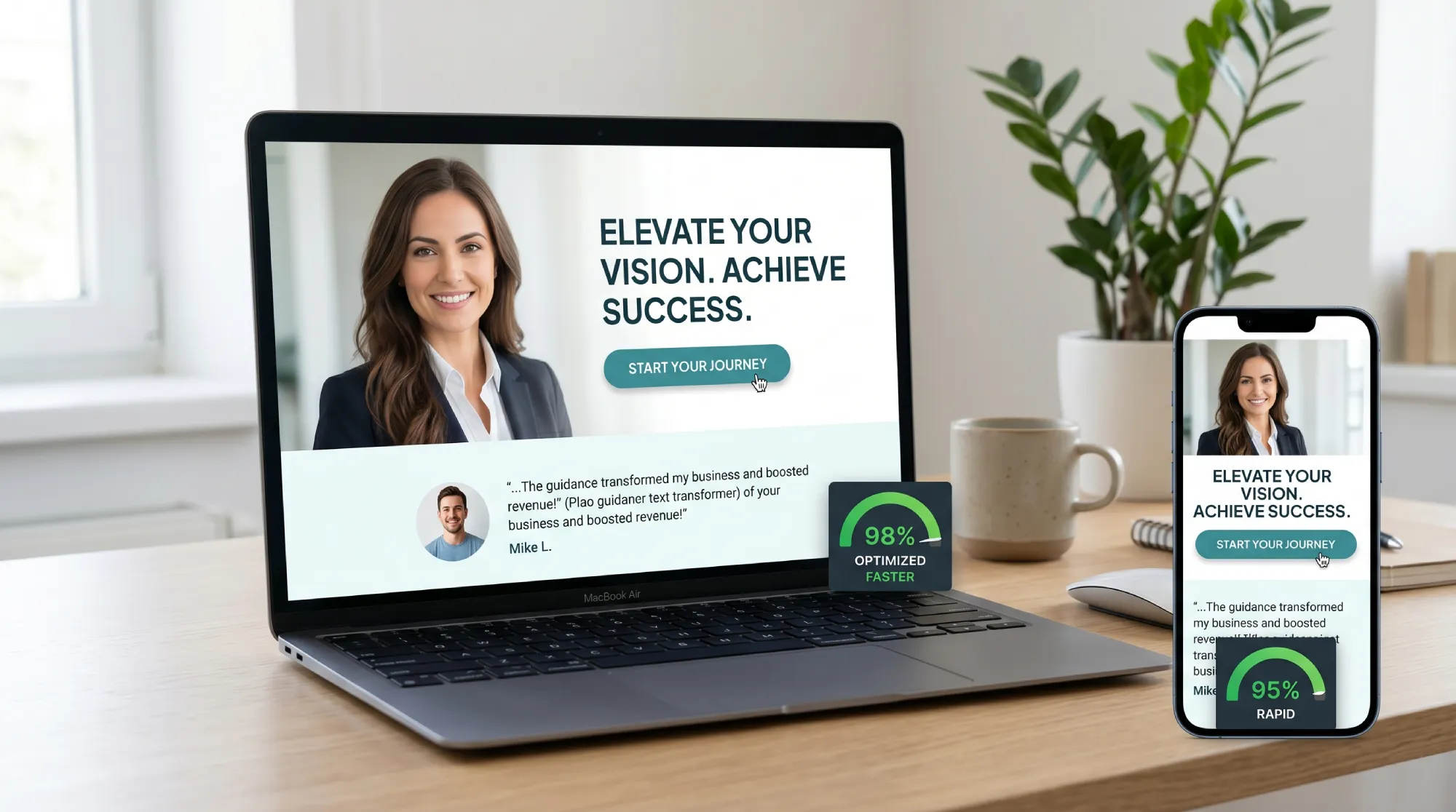
For independent professionals, this is particularly important. People aren't hiring a company when they reach out to you. They're hiring a person. A website with no visible, genuine human presence, no real photograph, no name, no point of view that sounds like it came from an actual individual, creates a quiet friction that most visitors can't quite name but that consistently reduces the likelihood of them making contact.
Stock photography is worth mentioning specifically here. It is immediately recognizable to visitors as stock photography, and it communicates something unintended: that you didn't want to show who you actually are. For a profession built on personal relationship and trust, that's a significant cost for a seemingly minor design decision.
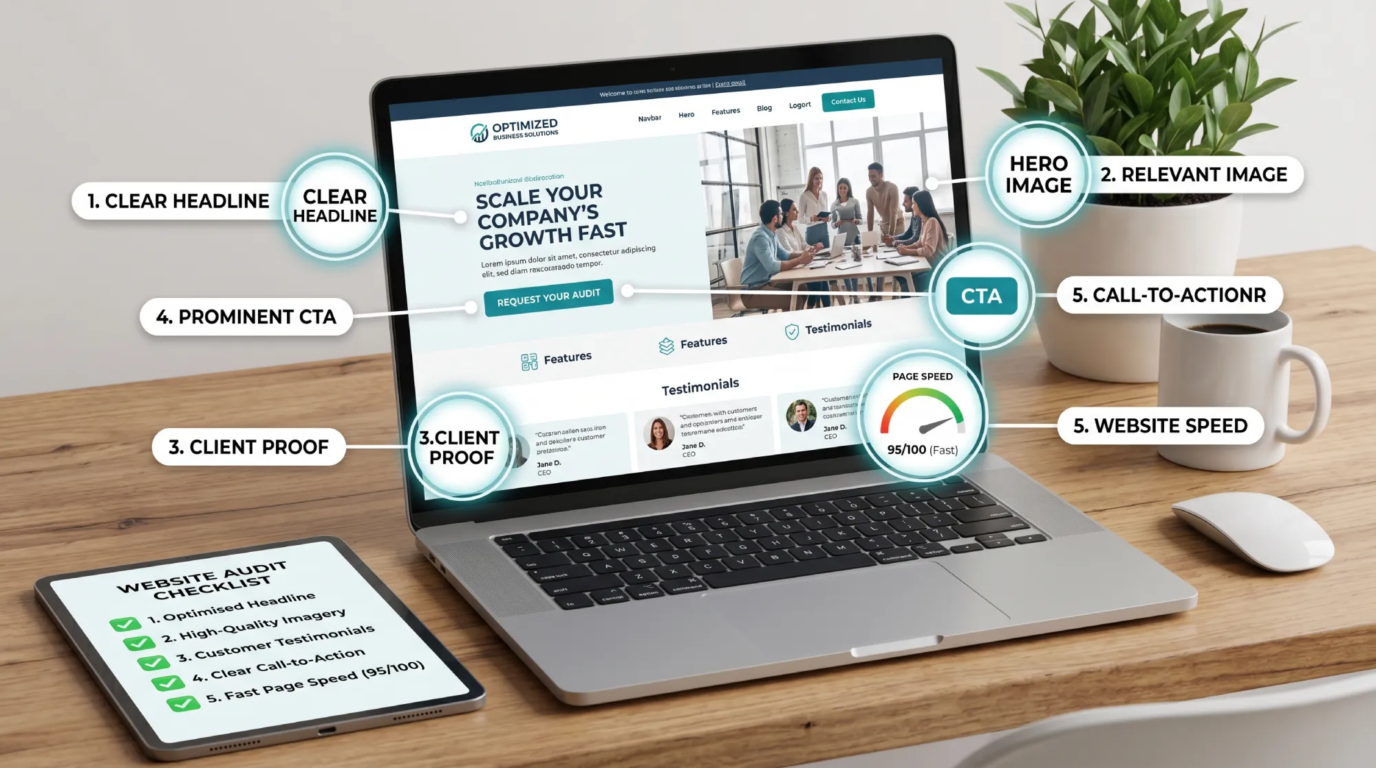
Five Things You Can Check Today
The gap between a website that generates inquiries and one that doesn't rarely comes down to one large problem. It usually comes down to several small ones, each of which is individually fixable.
1. Your opening line
Read the first sentence a visitor sees when they land on your homepage. Ask yourself: does this tell someone who has never heard of me whether I'm the right person for what they're dealing with? If it starts with "I am" or "We provide," rewrite it from the visitor's perspective. What are they experiencing? What are they hoping to find?
2. Your photograph
Is there a genuine photograph of you on your website, not a logo, not a stock image, not a stylized illustration, that a visitor can find within the first scroll? If not, that's worth addressing before anything else. It doesn't need to be professionally shot. It needs to look real.
3. Your social proof
Are there testimonials on your site? If so, are they specific enough to be useful? A testimonial that describes a real situation and a real change, something like "I came in with X and left with Y," carries far more weight than a general endorsement. Two or three specific testimonials outperform ten generic ones.
4. Your next step
What is the one action you want a visitor to take after reading your page? Is it immediately clear what that action is, and is there a single prominent way to take it? If a visitor has to hunt for a contact link, or if there are four different calls to action competing for attention, most of them will choose none of them. One clear path forward, consistently placed, converts better than multiple options.
5. Your load speed on mobile
The majority of people visiting your website are doing so from a phone, often while waiting somewhere or between tasks. If your site takes more than three seconds to load on mobile, research consistently shows you're losing roughly half of those visitors before they've seen anything. You can check your current speed for free using Google PageSpeed Insights. Entering your URL takes thirty seconds and gives you a concrete score to work from.
The Mindset Shift That Changes Everything
The professionals who get the most from their websites tend to think about them differently from those who don't. Rather than treating a website as a digital brochure, something that exists to describe what they do, they treat it as the first real conversation they have with a potential client.
In that framing, the goal isn't to impress. It's to make the visitor feel, within the first few seconds of arriving, that they've found the right person. That feeling is built through specificity, through genuine presence, through clarity about what happens next. It doesn't require elaborate design or expensive photography or thousands of words of content.
It requires understanding that every visitor who lands on your page is quietly asking the same question: Is this the right person for what I'm dealing with? And making sure your website answers that question before they have a reason to leave.
Every inquiry you're not getting today isn't necessarily from someone who decided you weren't the right fit. It may well be from someone who never got far enough to find out.
Is your website answering the right question?
At Evida Studio, we build digital presences for independent professionals designed to turn visitors into conversations, starting from the first second they land on your page.
Let's Review Your Website